QR Menu Examples
QR Menu Examples
Below are nine real, working menus. Scroll them, switch categories, open them full screen — they behave exactly as they would on a guest’s phone, because they are the same pages a guest would get.
Then, further down, the part most galleries leave out: how to choose between them based on your room rather than your taste.
150+ restaurants, cafés and bars on Web Gerek
Choose for the Room, Not for the Mood Board
Design galleries invite you to pick what looks best on a laptop in an office. Your guests will read this at a table, often in low light, usually one-handed, sometimes while a server is standing there. Those conditions eliminate more options than taste does.
Four properties of your venue decide most of it: how bright the room is, how long the menu is, how much of it benefits from photography, and whether guests are seated or standing.
Low light is the most under-considered. A dim bar or a candlelit dining room is exactly where thin light-weight type on a pale background becomes unreadable, and where a guest turning up their screen brightness ruins the atmosphere you paid a designer to create. High-contrast layouts with heavier type win in dark rooms, and they cost nothing to choose correctly at the start.
Menu length is the second. A long menu — forty, sixty items — needs a layout that supports fast scanning: clear category separation, prices aligned so the eye can run down them, restraint with photos. A short menu can afford to be generous with imagery because the guest will reach the bottom regardless.
| Your situation | What to prioritise | Designs that fit |
|---|---|---|
| Dim room — bar, evening dining | High contrast, heavier type, restrained imagery | Swiss, Newspaper, Luxury |
| Long menu, 40+ items | Fast vertical scanning, aligned prices, few photos | Swiss, Classic, Newspaper |
| Photo sells the dish | Generous image sizing, shorter categories | Tropical, Retro, Coffee |
| Guests standing in a queue | Big tap targets, short categories, quick load | Kraft, Coffee, Classic |
| Warm, casual, daytime | Texture and colour without losing legibility | Kraft, Retro, Coffee |
| Formal or high-ticket | Restraint, whitespace, quiet typography | Luxury, Swiss |
One caveat worth naming: the Luxury design renders items without photographs. On a menu where the photography is the selling point, that is the wrong trade — pick it for wine lists, tasting menus and rooms where a picture of the food would cheapen it.
What to Look at While You Scroll the Examples Above
Most people scroll a design gallery looking at colour. Colour is the least consequential thing on the list. Four things to check instead, on each example, on your phone rather than a desktop:
How the category strip behaves
Tap through the tabs. Does the strip fit, or does it scroll sideways? Now imagine it with your number of categories rather than the demo’s.
Where your eye lands on price
Prices should be findable without reading the description. If you have to hunt for the number on a demo menu, your guests will hunt on yours.
How a long dish name breaks
Find the longest item on the demo. Does it wrap gracefully or does it collide with the price? Your menu almost certainly has a longer one.
Whether it reads at arm’s length
Hold the phone where you would actually hold it at a table, not up close. A surprising number of designs that look elegant at reading distance become work at dining distance.
You Are Not Locked In
The design is stored separately from your content, which makes this a much lower-stakes decision than it feels. Switch from one of the nine to any other in a single click and your categories, items, prices, photos and translations carry over untouched.
The printed code does not change either. It points at your menu’s address, not at a particular design, so a venue that redecorates in spring can re-skin its menu to match without reprinting a single table card.
The practical advice, then: pick the one that suits the room today, launch, and revisit after a month of watching guests actually use it. That is better information than any amount of deliberation now.
Photos of Food Are a Trade, Not an Upgrade
The most common regret with a first digital menu is photographing everything. It feels like the obvious use of a format with no page limit, and it produces a menu that scrolls three times as long and reads like a catalogue.
Photos do two jobs well. They sell a dish whose name does not explain it, and they set expectations about portion and presentation, which reduces the disappointment that arrives with the plate. They do those jobs for the dishes where the answer is genuinely in doubt — not for a Caesar salad.
What they cost is position. Every image pushes the items beneath it further down, and the dishes at the bottom of a photo-heavy category are effectively invisible. On a printed menu a photo costs ink; on a phone it costs the visibility of everything under it, which is a much steeper price.
The practical rule most venues land on after a month: photograph the signature dishes, the high-margin ones, and anything with a name a guest would have to ask about. Leave the rest as text. If you are unsure, ship it without the photo and add one later — that is the direction that is easy to reverse.
One production note that matters more than camera quality: shoot the whole menu in one session, in daylight, near a window. Photos taken across several weeks under different lighting look mismatched when stacked vertically, and a phone camera in good light beats an expensive camera in bad light every time.
Live Examples
Working QR Menu Examples
These are not screenshots — they are real, working menus. Scroll them and switch categories the way a guest would on their own phone. This is exactly what your customers see.
Scroll inside any menu · Tap the link underneath to open it full screen
Designs
11 QR Menu Designs
All of them are included on the free plan. Switch designs later in one click — your categories, items and photos carry over untouched.
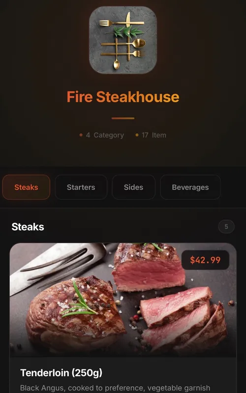
Classic
Digital QR menu for restaurants and cafes
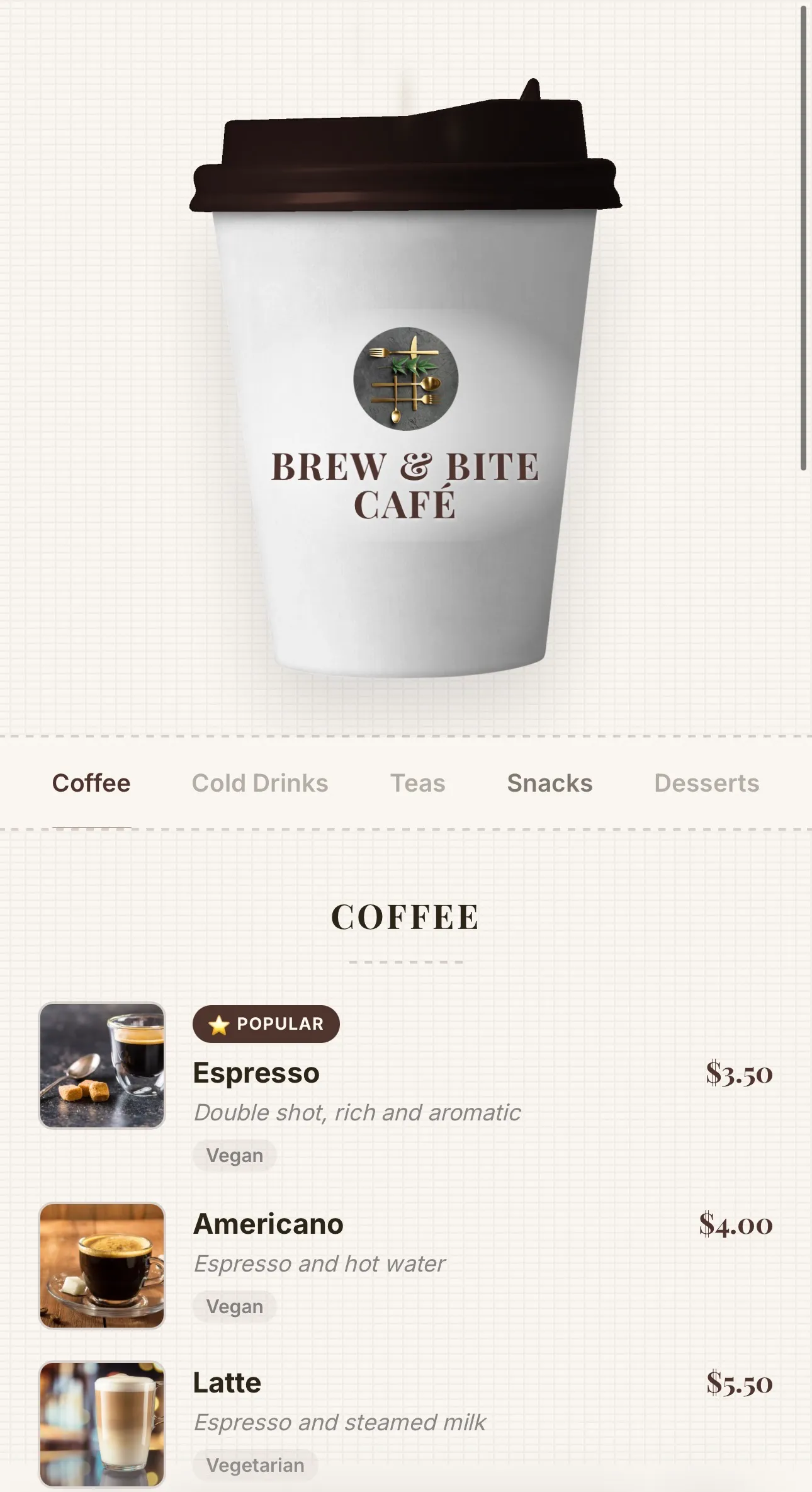
Coffee
Coffee-cup menu for cafés — lid recolours to your theme, café name printed on the cup, and rising steam
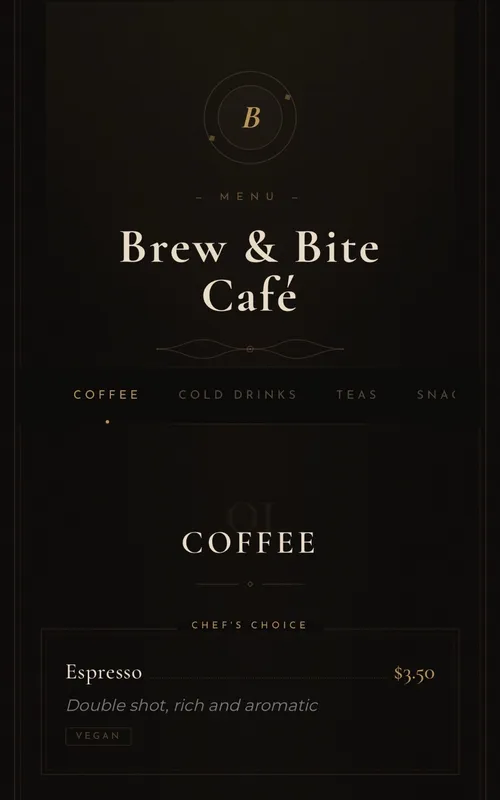
Luxury
Elegant typography-based menu for fine-dining restaurants
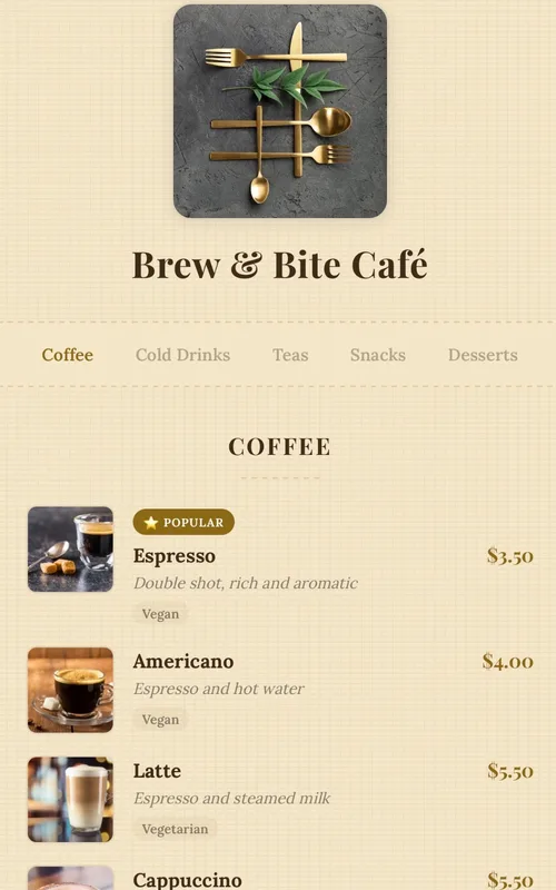
Kraft
Handcrafted paper-textured artisan menu — warm tones, serif typography and dotted price leaders
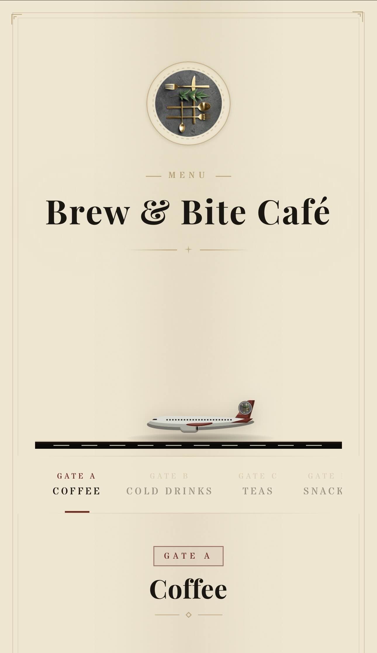
Aviation
Vintage aviation-themed QR menu — animated planes, runway and brass details
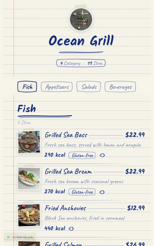
Ballpoint
Handwritten menu in blue biro on ruled notebook paper — course headings in a thicker pen, photos taped to the page
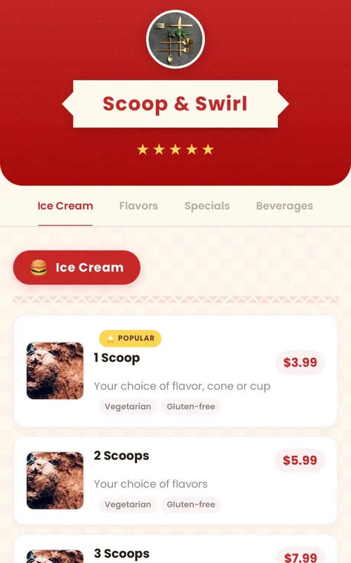
Retro
Fun retro diner-themed digital menu — checkered patterns, ribbon banners and colorful category badges
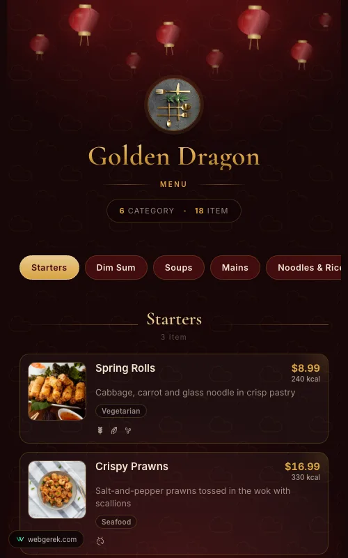
Lantern
Lacquer-red and gold menu under drifting paper lanterns — for Chinese, far-eastern and pan-Asian restaurants
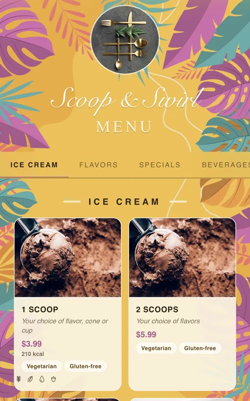
Tropical
Sunny summer-themed menu framed by tropical leaves and flowers — for cocktail bars, beach venues and summer cafés
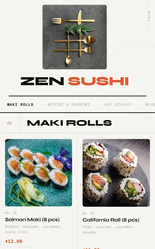
Swiss
Modern menu design with geometric grid layout, bold typography and animations
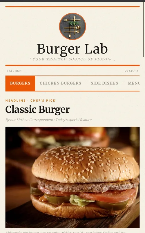
Newspaper
Newspaper-themed creative digital menu — dishes presented as headlines, columns, and news
Frequently Asked Questions
Are these examples real menus or mockups?
Are all 11 designs available on the free plan?
Can I customise the colours to match my branding?
Which design do most venues pick?
Related Pages
Your Menu, Live in 10 Minutes
Start on the free plan. No credit card, and no per-table or per-scan fees.
150+ restaurants, cafés and bars on Web Gerek