Restaurant QR Menu
Restaurant QR Code Menu
A phone screen shows about four items at a time. Every assumption in your printed menu about what the guest sees first — the layout, the eye path, the box around the special — stops holding the moment the menu becomes a scroll.
That is not a reason to avoid digital. It is a reason to rebuild the ordering rather than transcribe the page.
150+ restaurants, cafés and bars on Web Gerek
Menu Engineering Does Not Survive the Transcription
A printed menu is a designed field of view. You put the high-margin dish in the upper right because that is where the eye lands, you box the special, you use whitespace to slow the reader down. All of that is spatial, and a phone has almost no space.
On a phone the guest sees roughly four items at once and moves through the menu linearly. The only positional advantage left is order: what comes first in a category, and what order the categories are in. That is a smaller lever than a print designer is used to, but it is a sharper one, because there is no competing visual noise.
The practical translation. Put the dish you want ordered first in its category, not in the middle where a print grid would have placed it. Keep categories short enough that a guest reaches the end — a twelve-item mains list gets scrolled past its middle, an eight-item one gets read. And be ruthless about description length, because on a phone a long description does not add richness, it pushes the next three dishes off the screen.
The anchoring trick still works and works better. A high-priced item near the top of a category makes what follows read as reasonable, and on a phone the guest encounters it in a fixed order you control rather than wherever their eye happened to land.
First in category beats anywhere else
Position is the only layout lever left. Spend it on the dishes you actually want to sell.
Eight items per category, not fifteen
Guests reach the bottom of a short list. They abandon the middle of a long one, and the abandoned middle is invisible inventory.
Two lines of description, maximum
Every extra line pushes another dish below the fold. Description length is a zero-sum trade against the dishes underneath.
Photograph selectively
A photo on every dish reads as a catalogue and doubles the scroll. Photograph the signatures and the ones whose names do not explain them.
Dense Menus, Read at Dining Distance
Two layouts built for longer lists: clear category separation and prices your eye can run down without reading every description.
Swiss
Open full screen →Newspaper
Open full screen →What Changes About Service
The operational effects are less obvious than the printing savings and generally larger.
The menu now arrives before the server does. A guest who sits down and scans has read the first category before anyone has come over, which shifts the first server touch from delivering menus to taking a drinks order. Over a service that is a meaningful amount of floor time returned.
The special becomes editable. When the halibut runs out at eight, someone at the pass hides it in ten seconds from their own phone. The alternative is the conversation you currently have four times an hour, where a server explains that the thing printed on the menu is gone — which is both a service irritation and a small, repeated disappointment at the table.
Lunch and dinner stop fighting each other. If your lunch and dinner offers genuinely differ, a printed compromise menu serves neither well. Two menus, published on a schedule you control, means the guest sees only what is actually available.
The one thing that gets harder, honestly: you lose the physical object. A well-made printed menu is part of the room and part of the price signal at the top end. Many full-service venues should run both — printed menus in the dining room and a QR code for the bar, the terrace and the guest who wants to check tonight’s list before they arrive. The saving comes from reprinting less often, not from eliminating paper.
Wine Lists, Allergens and the Long Tail
Two categories behave differently enough to plan for separately.
Wine lists are the strongest single argument for digital in a full-service restaurant. They are long, they change with every delivery, and they are the section most often out of date on a printed menu. A digital list can carry the producer, the region, the vintage and a tasting note without any of the space pressure that forces printed lists into terse code — and when a vintage changes you change one field rather than reprinting the book.
Allergens are the other. Nothing in US law requires you to mark them per dish — the six states with restaurant allergen laws ask for menu notices and staff training rather than labels — but a full-service room is exactly where marking them pays off. The alternative is a server relaying an allergy to the kitchen and relaying an answer back, twice per affected table, under time pressure, with a new hire on section three.
Both benefit from the same property: on a digital menu, depth is cheap. Adding a field costs nothing in print space, so the information that would never fit on paper can simply be there for the guests who want it, and invisible to the ones who do not.
Designs
11 QR Menu Designs
All of them are included on the free plan. Switch designs later in one click — your categories, items and photos carry over untouched.
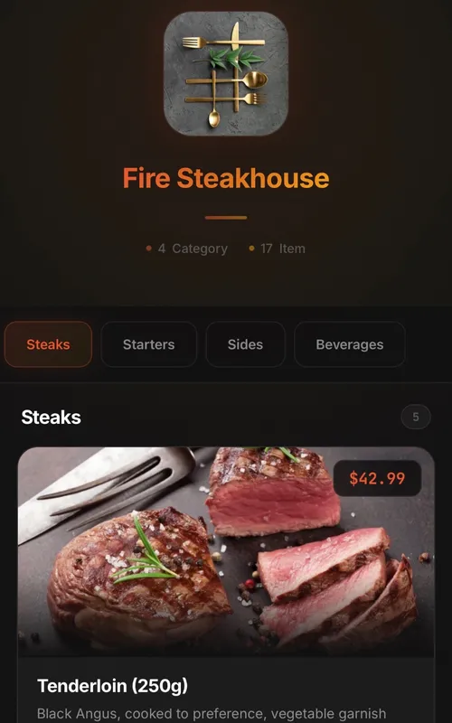
Classic
Digital QR menu for restaurants and cafes
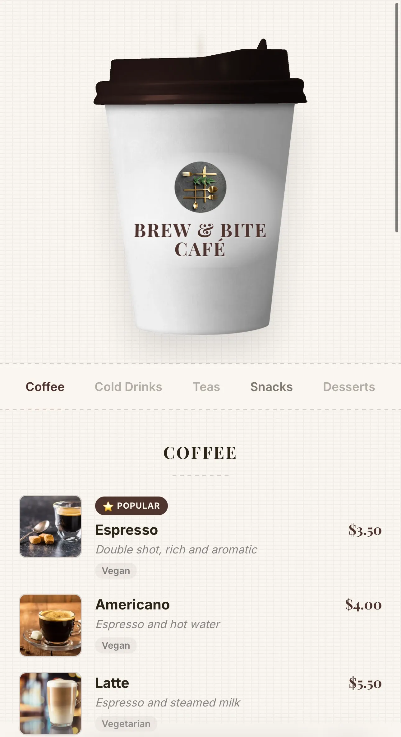
Coffee
Coffee-cup menu for cafés — lid recolours to your theme, café name printed on the cup, and rising steam
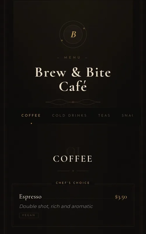
Luxury
Elegant typography-based menu for fine-dining restaurants
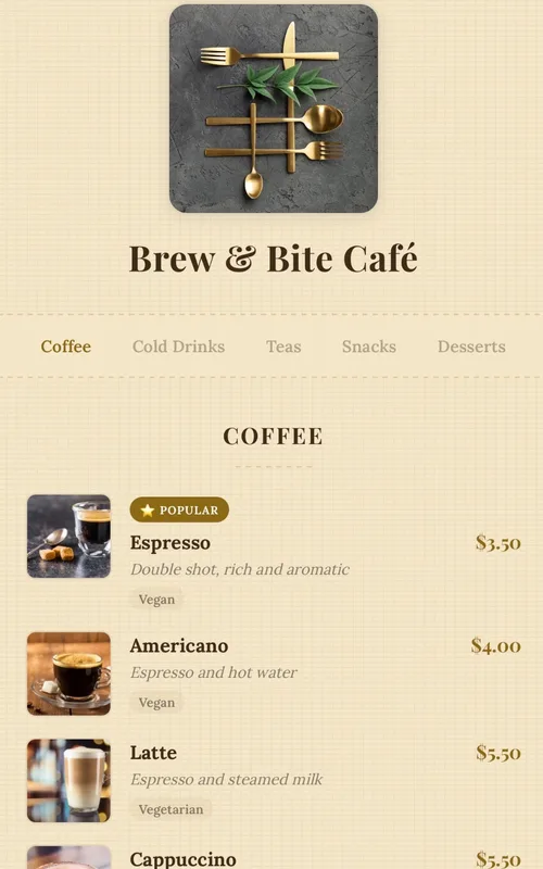
Kraft
Handcrafted paper-textured artisan menu — warm tones, serif typography and dotted price leaders
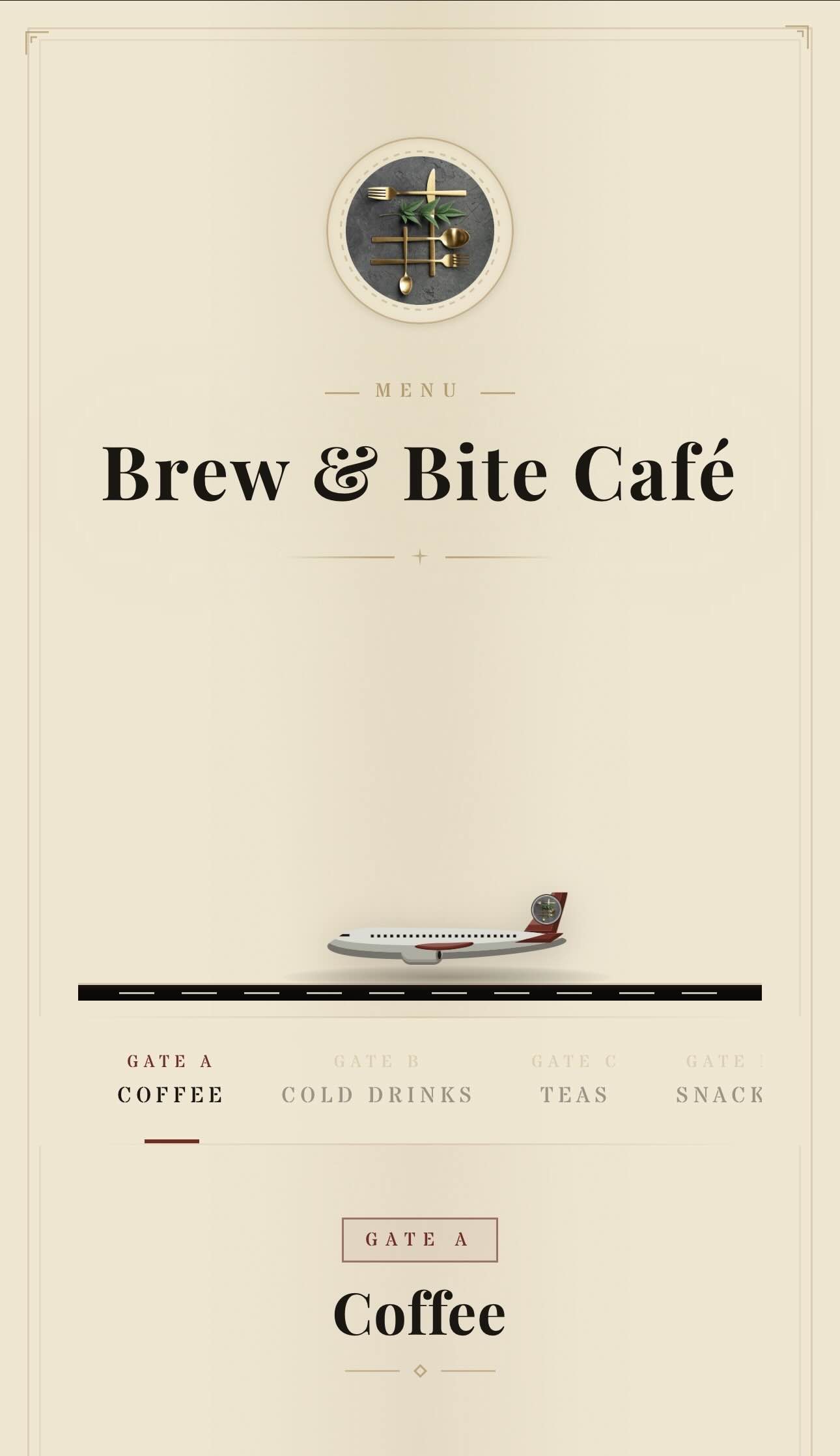
Aviation
Vintage aviation-themed QR menu — animated planes, runway and brass details
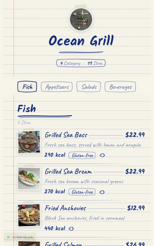
Ballpoint
Handwritten menu in blue biro on ruled notebook paper — course headings in a thicker pen, photos taped to the page
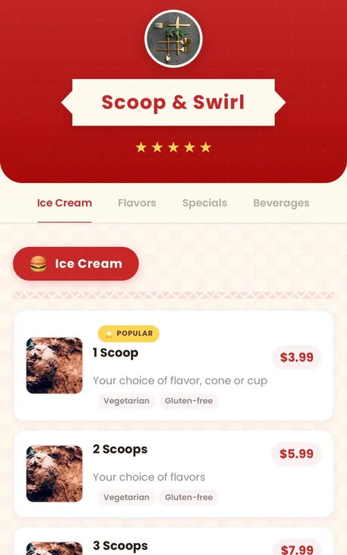
Retro
Fun retro diner-themed digital menu — checkered patterns, ribbon banners and colorful category badges
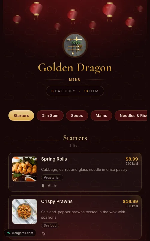
Lantern
Lacquer-red and gold menu under drifting paper lanterns — for Chinese, far-eastern and pan-Asian restaurants
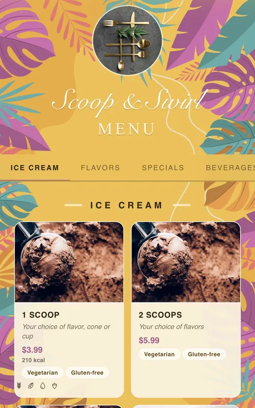
Tropical
Sunny summer-themed menu framed by tropical leaves and flowers — for cocktail bars, beach venues and summer cafés
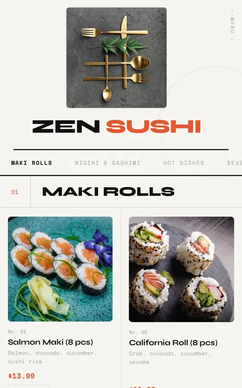
Swiss
Modern menu design with geometric grid layout, bold typography and animations
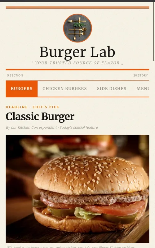
Newspaper
Newspaper-themed creative digital menu — dishes presented as headlines, columns, and news
Frequently Asked Questions
Should I stop printing menus entirely?
How do I handle a daily specials board?
Can I run separate lunch and dinner menus?
Do guests find scanning at a nice restaurant off-putting?
Related Pages
Menu Labeling Requirements
Who has to show calories, and what US allergen law actually asks for.
Bar & Taproom QR Menu
If you run a bar alongside the dining room — rotating lists and low light.
Spanish & Multilingual Menus
Four languages behind one code, at no extra print cost.
QR Menu Maker
The build sequence and the pre-print checklist.
Your Menu, Live in 10 Minutes
Start on the free plan. No credit card, and no per-table or per-scan fees.
150+ restaurants, cafés and bars on Web Gerek